10 loudest rebrandings in Russia
1. ‘Leningrad’ to ‘St. Petersburg’
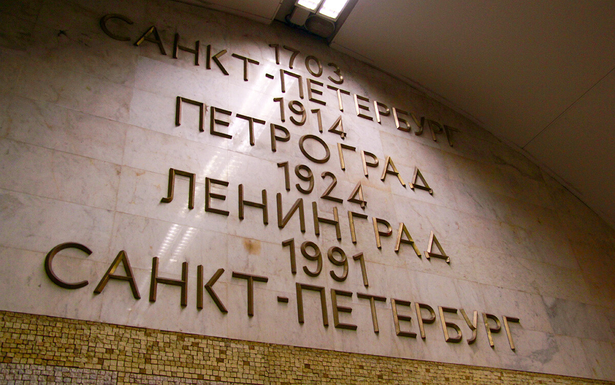 Transfer between Sennaya Ploshchad and Spasskaya stations in St. Petersburg metro
Perhaps one of the most significant events of the 1990s was the mass renaming of toponyms and the return of their historical names, which were changed in the Soviet era. Leningrad was one of the first cities to receive its original name as a result of the 1991 referendum. By the way, Leningrad Region surrounding the city voted against the renaming and is still called this way.
2. ‘Militia’ to ‘Police’
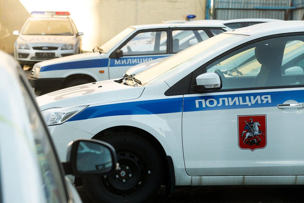 An old and an updated name
Throughout the world, ‘militia’ most often refers to spontaneous armed formations that maintain order. After the 1917 revolution, the Bolsheviks established a “people's militia” to replace the tsarist police. However, later, the Soviet militia, subordinate to the Ministry of Internal Affairs, became a state body, after all. In 2011-2012, the now Russian militia was renamed ‘police’. This was an image step within the framework of the reform in the Ministry of Internal Affairs. In this way, the fight against corruption and improvement of the efficiency and prestige of the agency were symbolically asserted.
3. ‘GAI’ to ‘GIBDD’
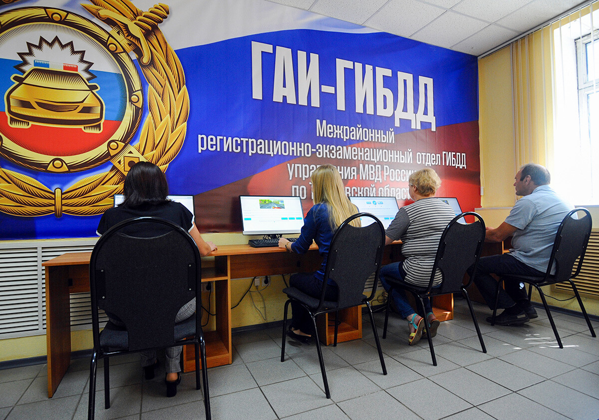 People passing a test to driving license. GAI-GIBDD logo is pictured above
For a long time in the USSR, every motorist knew those three scary letters – ‘GAI’. They stood for ‘State Automobile Inspection’. The agency was established in 1934 and did not cease its activities even after the collapse of the USSR. However, in 1998, the structure was renamed ‘GIBDD’ (‘State Inspectorate for Road Traffic Safety’). According to the initiators, this name better reflects the essence of the inspectors’ work.
4. ‘Siberia Airlines’ to ‘S7 Airlines’
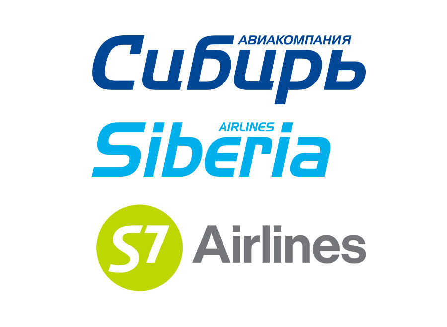
Siberia Airlines was born in the city of Novosibirsk in 1992. Prior to that, scheduled civilian flights had already been flying from the local airport for more than 35 years. In the mid-2000s, after the airline joined ‘IATA’ (International Air Transport Association), it changed its name to ‘S7 Airlines’. Today, it is the second largest airline in Russia.
5. ‘Ministry of Railways’ to the ‘Russian Railways’
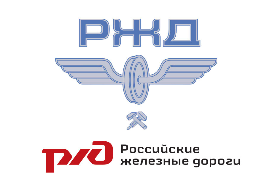
Today, it seems that the Russian Railways state-owned company has always existed. But, the brand only appeared in 2003 on the basis of the Russian Ministry of Railways. Before that, it was the Ministry that managed all railway transportation and roads.
Until 2007, the company had a logo with light blue colors. Under the letters ‘РЖД’ («Российские железные дороги») was a railroad wheel with wings and a hammer crossed with a wrench. But, by 2010, a new, “modern” logo was fully implemented, which featured the abbreviation of ‘Russian Railways’ in red letters.
6. ‘ВКонтакте’ (‘Vkontakte’) to ‘VK’
Russia's largest social media network ‘Vkontakte’ literally means 'in contact'. It moved from ‘vkontakte.ru’ to ‘vk.com’ back in 2012. Its founder Pavel Durov hoped to enter the international market with the more international name ‘VK’.
These two letters are still on the logo of the social network and are included in the name of all its services, from ‘VK Music’ to its own payment system ‘VK Pay’. ‘VK’ is also the name of the corporation that owns the social network (former Mail.ru Group).
7. ‘MTS’ logo with egg to ‘MTS’ logo without egg
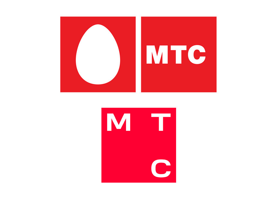
Rebranding does not always have to include a renaming. Sometimes, it is a radical change of the logo. In 2023, one of Russia's biggest mobile telecommunication systems – ‘MTS’ (literally ‘Mobile TeleSystems’) – removed the generic white egg from its logo, which had been there since 2006.
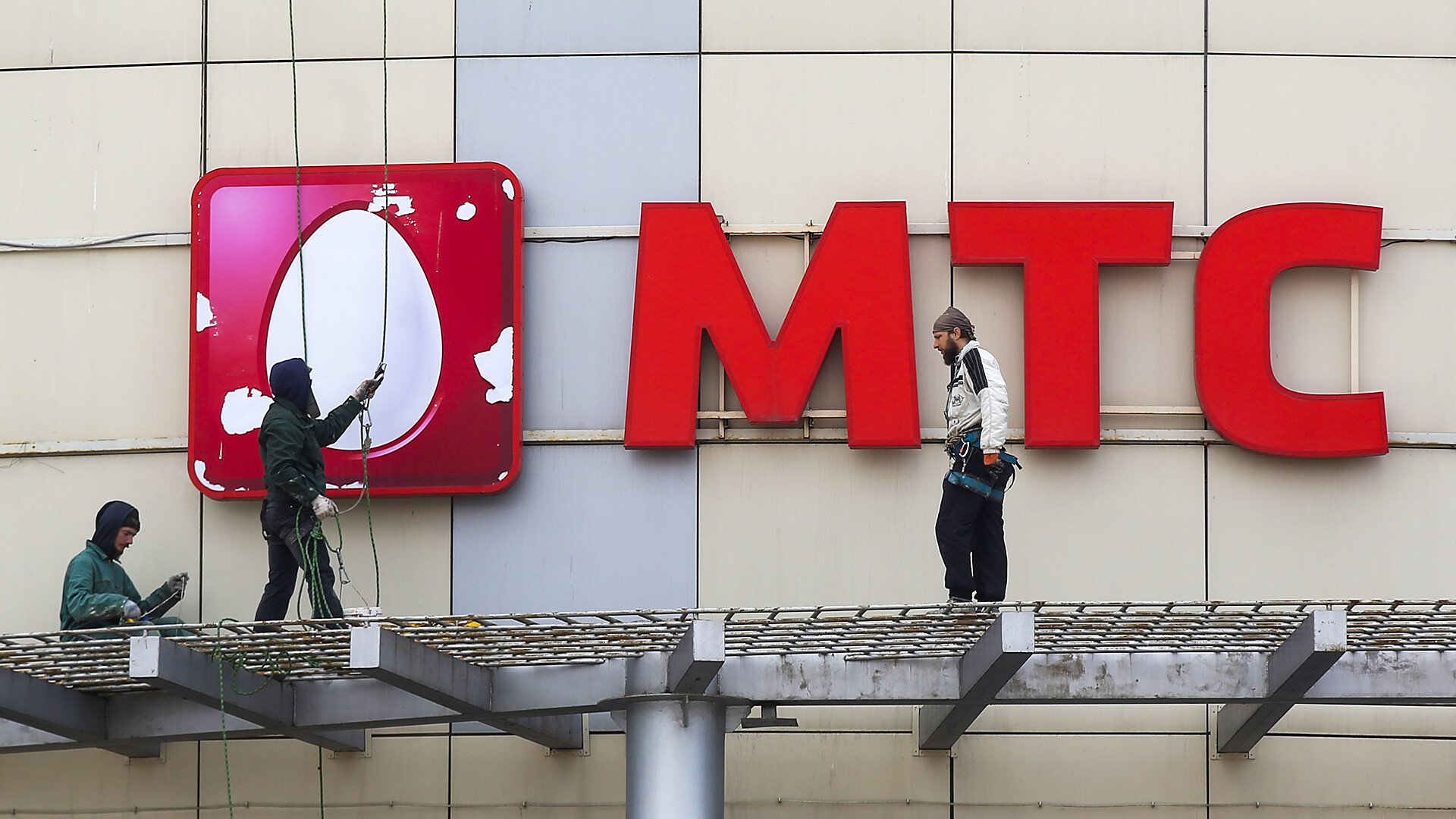
Instead of it, the letters ‘МТС’ (‘MTS’) are now written on the perimeter of the square. This was due to the desire of the cellular network to reinvent itself. After all, it is now a brand involved in much more than just telecommunications.
8. ‘McDonald’s’ to ‘Вкусно и точка’ (‘Vkusno i tochka’)
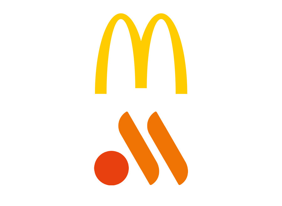
Well, technically it was not a rebranding per se… The American chain “left” Russia in Spring 2022, but already in the same summer, the former fast food restaurants reopened under the new name ‘Vkusno i Tochka’ (literally 'Tasty and that's it' or ‘Tasty and full stop’) with a new local owner with no ties to the American fast food chain. But, many people in Russia still refer to it as ‘Makdak’ (a Russified abbreviation of ‘McDonald’s’). And, although the new logo is said to refer to French fries and a burger patty, many people still see it as the letter ‘M’.
9. ‘Izbyonka’ to ‘VkusVill’
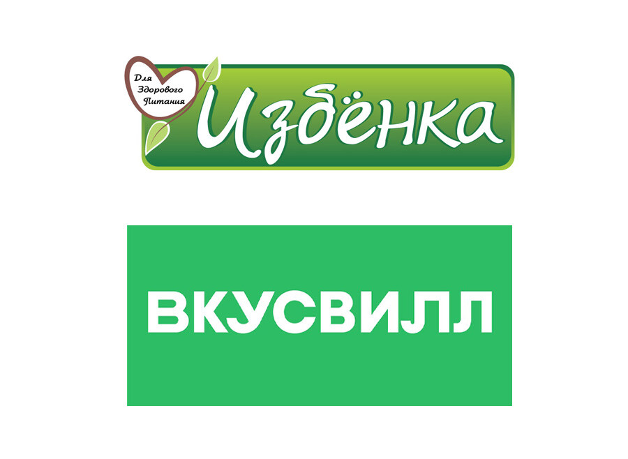
These days, ‘VkusVill’ grocery stores are literally on every corner in Russia (and there are several outside Russia, as well). They first opened in 2009 under the name ‘Izbyonka’ (‘small hut’) and only sold dairy farm products. The new brand appeared in 2012 and, at first, existed in parallel with the old chain. But, after three years, the name ‘VkusVill’ (‘Tasteville’) finally won. At the same time, some of the dairy products in the stores still bear the brand name ‘Izbyonka’.
10. ‘Sberbank’ to ‘Sber’
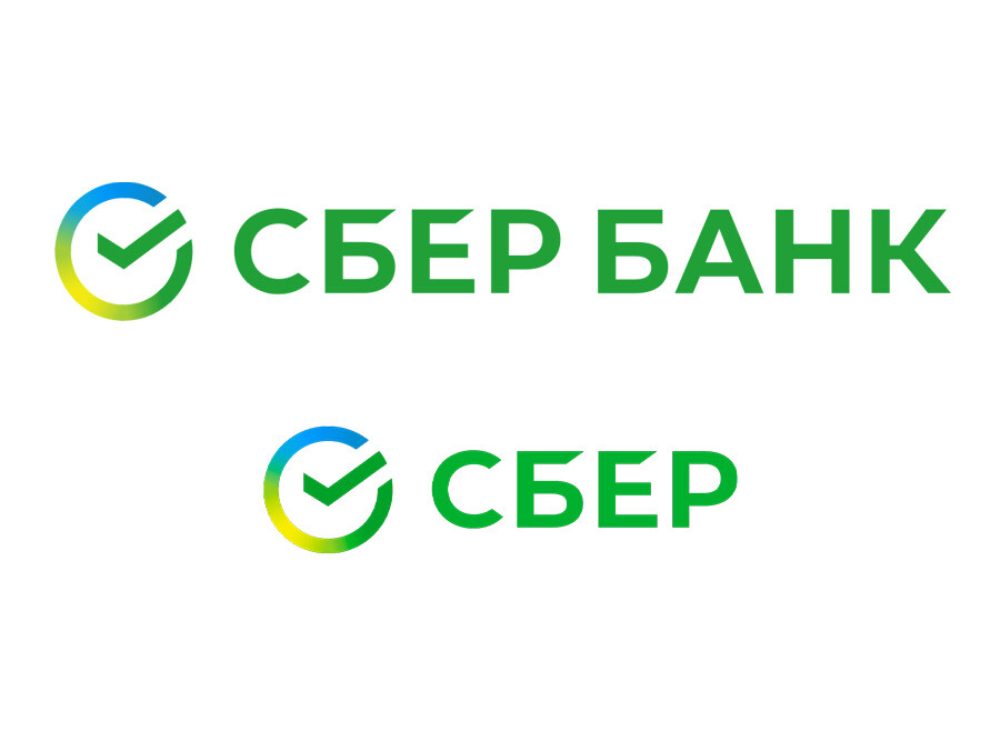
The name ‘Sberbank of Russia’ grew out of the ‘Savings Bank of the USSR’ (‘Сберегательный банк’, ‘sberegatelny bank’), which, in turn, was the successor to the savings banks of the tsarist times.But, in 2020, the bank registered the trademark ‘Sber’. Ironically, this is how people had referred to it for a long time. The green brand colors and a check, which is meant to symbolize purposefulness, remained on the logo. However, ‘Sberbank’ has remained in some financial services and it is still the official name of the joint-stock company.
BONUS
‘Russia Beyond’ to ‘Gateway to Russia’
Your most favorite media is changing its name and concept from December 2024. We are now known as the ‘Gateway to Russia’, a portal which will contain the most relevant information about Russia, tips for traveling or moving to Russia, as well as loads of handy lessons for those who want to learn or are studying Russian. Keep an eye on the updates!


